
The Story Behind Foothill Pet Hospital's Logo Animals
— Designed By Lisa
Dr. Rittenberg (Dr. Ritt) and I combined our thoughts and desires for Foothill Pet Hospital’s (FPH’s) logo. We both thought our logo should be eye-catching, distinctive and unique, while still being professional, creative, fun and animal-oriented.
Dr. Ritt has always been into prehistoric art, fossils, minerals, and Native American designs. And, with my background and studies in fine art, art history, cave art, painting, gourd art, and spark to be creative, we proceeded to design FPH’s individual logo animals.
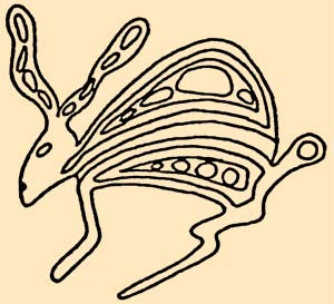
We thought about our enjoyment of Native American petroglyphs, and decided we would like something along those lines. This concept was further enhanced by the proximity of Painted Cave. Painted Cave is where some Native American drawings are located just ten minutes north of FPH off Highway 154. And, since we see multiple pet species, we wanted to make sure our logo would reflect many of the pets we see and treat. Putting all of this together, we decided upon a stylized petroglyphs theme.
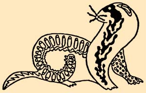
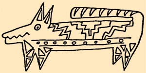
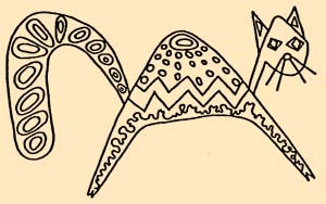
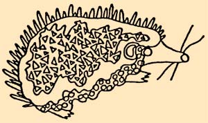
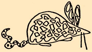
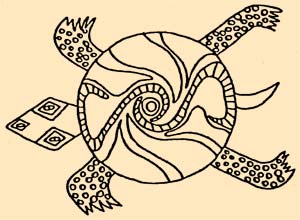
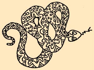
With this theme/image in mind, we decided that the animals we would depict were a dog, cat, turtle/tortoise, rabbit, lizard, snake, rat/mouse, hedgehog, and ferret. In this way, people would be able to immediately recognize some of the numerous types of pets we work with just from our logo. At present, there are nine animals in all.
To further help formulate my visual concept, I collected a variety of animal photos. These came from real petroglyphs, Native American art, African art, art books, magazines, and catalogs.
Then, I sat down, and drew my ideas of what modern stylized petroglyph animals would look like. (Of course, if you know me, they had to have an artsy twist to them.) I started with an 8” x 11” drawing of each animal. These drawings were done with a technical pen. Some came to me very quickly, and others took a fair amount of time. Yet, I had a lot of fun with all of them.
When I was finished with the initial drawings, I showed them to Dr. Ritt for his input. (He always jokes that he has “ultimate veto power” with things like this for FPH.)
From the beginning, we both loved the cat, turtle/tortoise, rabbit, and hedgehog. Based on our back and forth discussions and modifications, the others came along eventually.
The only animal we still disagree on is the dog. Dr. Ritt feels I pushed it too far with the short little legs, too long of a body, and the tail curved upwards over the body. 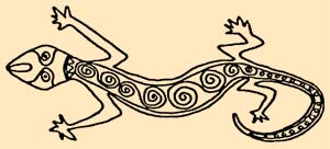
It has always bugged him to a certain degree. He felt the dog was too short and stocky, and he wanted his proportions to be a bit more balanced. But, in the end, he agreed to my preference on this one.
As it turns out, we both have to laugh nowadays. This is because if you have seen our beloved dog Bru, or his picture on the wall in the dog waiting room, he has that shape to his body and legs, and his tail does curl upward over his back! I think my drawing of the dog was a premonition of his future joining our family.
The reason I made the drawings a really large size was in order to add all the detailing within the animals. Another thing people may or may not notice is that the layout for our letterhead, business card, business envelope, brochure, advertisements and handouts are all a little different in how the animals are organized and oriented. By drawing each animal separately, I could rearrange them to suit a particular layout or design. And, to further enhance our petroglyph animals, we chose a typeset to compliment this theme too.
As an added touch, after the logos were developed, Dr. Ritt cajoled his dad into making stained glass windows of some of the animal figures. Initially, Dr. Ritt’s dad (Jerry) tried to do a window with all the animals from the business card’s design. While it was good, it didn’t have the feeling Dr. Ritt was hoping for each animal. It was just too crowded.
So, one by one as Jerry had the time to make a new window, Dr. Ritt would take my initial drawing, enlarge them, and using a lighted table, translate them into a stained glass format that his dad could use as a template. After finishing the design, Dr. Ritt would then go out and pick the various glass colors he wanted for them. All of this took a lot of time. But, I think when you see them hanging, it was worth the effort.
After first having Jerry do the cat, the dog, rabbit, turtle/tortoise, lizard, rat/mouse followed. For now, we haven’t bugged Jerry for the rest, but we do joke with him that he still has to do all of the other figures too. We tell him since he’s retired, what else does he have to do! Besides, we think they look great, and it always gives Dr. Ritt a happy reminder about his dad.
And, it seems other people seem to really enjoy them too. We have one window hung in each of the two waiting rooms. And, they are rotated periodically.
I am very proud and happy I was able to create the logo images for Foothill Pet Hospital. I feel they turned out very stylized and artsy, but yet remain professionally classy.
And, while it is very rewarding to get so many nice compliments on their appearance, I feel they have served their purpose too. I believe they have given us that recognizable identity in the community that we initially set out to accomplish.